Layout Builder & Frontend Editing
Open Intranet bundles two complementary editing experiences that together cover the spectrum from “rearrange the whole page” to “fix this typo right now”. They are deliberately kept separate so each one can be enabled per content type, per role, or both:
- Layout Builder — The visual what goes where tool. Drag-and-drop sections and blocks onto a page; pick from one-, two-, three-column layouts, custom CSS classes and per-section styles. Used by site builders to create rich landing-style pages without writing a template.
- Frontend Editing — The inline fix it on the live page tool. Click an edit icon on any field of a published page (without leaving the page) to open a small modal that saves the change and refreshes just that field — no full edit form, no context-switch.
The two tools are completely independent — a content type can use either, both, or neither.
Layout Builder
Section titled “Layout Builder”What it is
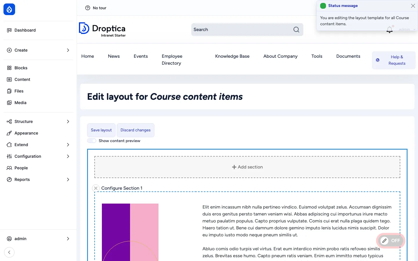
Section titled “What it is”Layout Builder is a Drupal core module that lets a site builder define the layout of an entity’s display visually: which sections, which columns, which fields go where, what blocks (custom or system) appear alongside, and what styles each section uses.
In Open Intranet it is enabled out of the box on the Course content type (one of the heaviest layout users in the bundle) and is available to be enabled on any other bundle from the Manage display admin page.
Two modes
Section titled “Two modes”Layout Builder has two distinct modes:
| Mode | Where it lives | Purpose |
|---|---|---|
| Default layout | /admin/structure/types/manage/{bundle}/display/default/layout | The template layout for all items of this type. Editing it changes every existing item that has not been customised. |
| Per-item layout | The Layout tab on each individual item | Override the default layout for this one item only. Used for landing pages and one-of-a-kind content items. |
Per-item layouts can be enabled per bundle (Allow each content item to have its layout customized).
Sections and blocks
Section titled “Sections and blocks”A layout is composed of sections stacked vertically. Each section uses a layout plugin (one column, two columns, three columns, two-thirds + one-third, etc.) that determines its column structure. Inside each column the editor places blocks — which can be:
- Field blocks — one block per content field (Title, Body, Tags, Image, Reaction…) so fields can be ordered, hidden, or repositioned across columns.
- Custom blocks — reusable blocks managed under Structure → Block layout.
- System blocks — site-wide blocks (Search, Menu, Recent posts, Recently read, etc.).
- Inline blocks — one-off content blocks created right inside the Layout Builder dialog, scoped to this layout only.
Adding a section, dropping a block in, configuring the block, and saving — all happen on the same page via a sidebar dialog, with a live preview updating as you go.
Layout Builder Styles
Section titled “Layout Builder Styles”The Layout Builder Styles module adds a style picker to each section and each block. Site builders pre-define styles in YAML (e.g. Hero with overlay, Tinted background, Card grid, Compact, Negative space large) and editors pick from a dropdown — giving the layout a consistent design language without exposing raw CSS to editors.
Layout Custom Section Classes
Section titled “Layout Custom Section Classes”The Layout Custom Section Classes module adds a free-form Custom CSS class field to each section, so site builders / admins can hook ad-hoc styles into any section without creating a full style preset.
Frontend Editing
Section titled “Frontend Editing”What it is
Section titled “What it is”Frontend Editing puts a small toggle in the bottom-right of every page (a pill button labelled Off / On). When the editor flips it to On, the page enters edit overlay mode:
- A green status banner confirms
Frontend editing has been enabled. - Every field on the page that the user can edit shows a hover icon.
- Clicking the icon opens a slim modal pre-populated with the field’s current value.
- Saving updates the field in place — no full reload, no context switch, no autosave dialog interrupting the flow.

Per-field, per-bundle opt-in
Section titled “Per-field, per-bundle opt-in”Frontend Editing is enabled per bundle in the Manage display screen — alongside the field’s display settings, a small Edit on the frontend checkbox decides whether that field becomes click-to-edit on the live page.
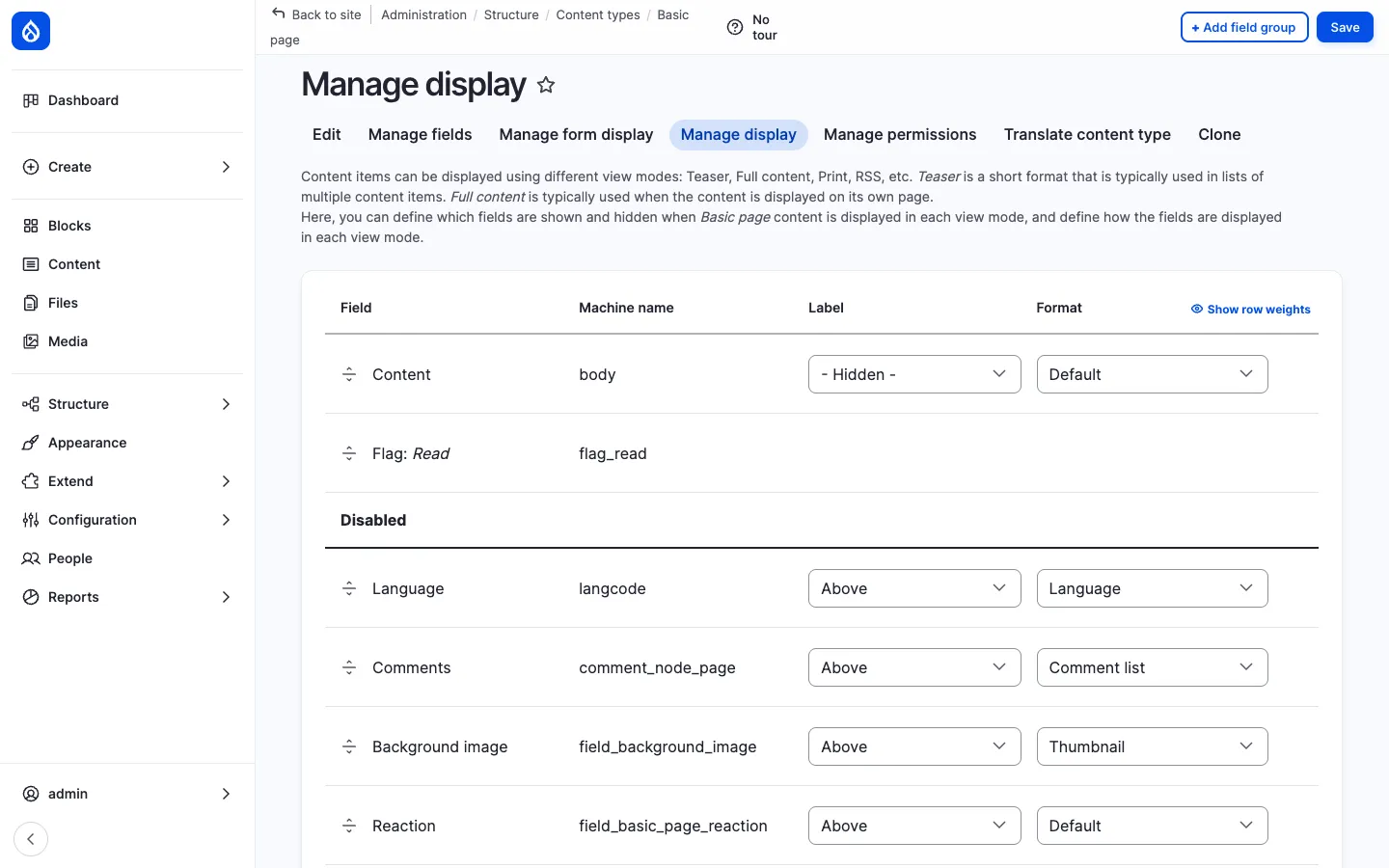
The granularity matters — sensitive fields (e.g. Author, Created date, Published status) can stay un-edit-able from the front-end while the Title and Body are click-to-edit.
What it edits
Section titled “What it edits”Out of the box Frontend Editing supports:
- Plain-text fields — title, name, simple text fields. Inline input.
- Long-text fields — body, descriptions. Opens a modal with the same CKEditor 5 instance as the full edit form (so the AI assistant is available too).
- Image / file fields — upload + alt text from the modal.
- Entity reference fields — autocomplete in the modal.
- Layout Builder regions — when both modules are enabled, FE icons cover Layout Builder blocks too.
Permissions
Section titled “Permissions”Frontend Editing respects existing entity permissions: the user must have edit access to the entity for the icons to appear. Admins can additionally restrict the front-end editing UI itself with the use frontend editing permission — useful for “any content editor can use the full edit form, but only senior editors can do quick inline fixes from the live page”.
Comparison
Section titled “Comparison”| Need | Use |
|---|---|
| Rearrange the whole page — change which columns appear, move blocks around | Layout Builder (per-item layout) |
| Style a landing page — apply hero / tint / card-grid styles to sections | Layout Builder (with Layout Builder Styles) |
| Fix a typo, swap an image, update a paragraph — already on the live page | Frontend Editing |
| Quick price / number change on a published item — without opening the full form | Frontend Editing |
| Build a custom layout for a one-off item (campaign landing, anniversary post) | Layout Builder (per-item layout) |
| Define the canonical layout for every News article | Layout Builder (default layout) |
Integration with other features
Section titled “Integration with other features”- Pages — The most natural Layout Builder candidate. Once enabled on the Page type, marketing / HR / IT can build per-page landing layouts.
- Knowledge Base — A landing-page approach with sections of featured articles, recently updated, and CTAs to specific KB books.
- News, Events — Frontend Editing is the recommended workflow for quick text fixes. Layout Builder is rarely needed but available.
- Courses (recipe) — Ships with Layout Builder enabled for the Course content type (the default layout shown above).
- AI assistant — When Frontend Editing opens a CKEditor field, the AI button is right there. Click Improve writing without ever opening the full edit form.
- Multilingual — Layout Builder layouts can be translated per language; Frontend Editing edits the field in the active language.
Permissions
Section titled “Permissions”| Permission | Default role(s) |
|---|---|
| Configure any layout (edit default layouts) | Administrator |
| Customize layout (per-item layout overrides) | Content editor |
| Use frontend editing | Authenticated user (configurable) |
| Administer Layout Builder Styles / Custom Section Classes | Administrator |
Modules behind it
Section titled “Modules behind it”- Drupal core:
layout_builder,layout_discovery - Layout Builder Styles
- Layout Custom Section Classes
- Frontend Editing
Learn more
Section titled “Learn more”- Pages — primary Layout Builder use-case
- Knowledge Base — also a strong fit for Layout Builder landing layouts
- AI Assistant in CKEditor — pairs perfectly with the Frontend Editing modal
- Courses recipe — ships with Layout Builder enabled by default
- Drupal Layout Builder docs